We want to look at all the kaggle submissions for 2016. first of all we need to download the data here
Analysis
Now lets run some R! First lets load in the data:
Code
library(dplyr)library(readr)library(stringr)library(ggplot2)library(reshape2)rm(list=ls())# Get list of all filesfiles <-list.files(path='predictions/', pattern='*.csv', full.names=T)# Load all filesallPredictions <-lapply(files, function(f) read.csv(f, stringsAsFactors = F))
Join all the predicitons, remove bad predictions, and calulate correlation
Code
pred =data.frame(lapply(allPredictions, function(x) x[,2]))# some preditions renedered to factor, remove thesepred.clean = pred[,-which(unlist(lapply(pred,class))=="factor")]cormat <-round(cor(pred.clean),2)# some correlations result in NA, remove thoseidx =which(is.na(cormat[1,]))cormat = cormat[-idx,-idx]
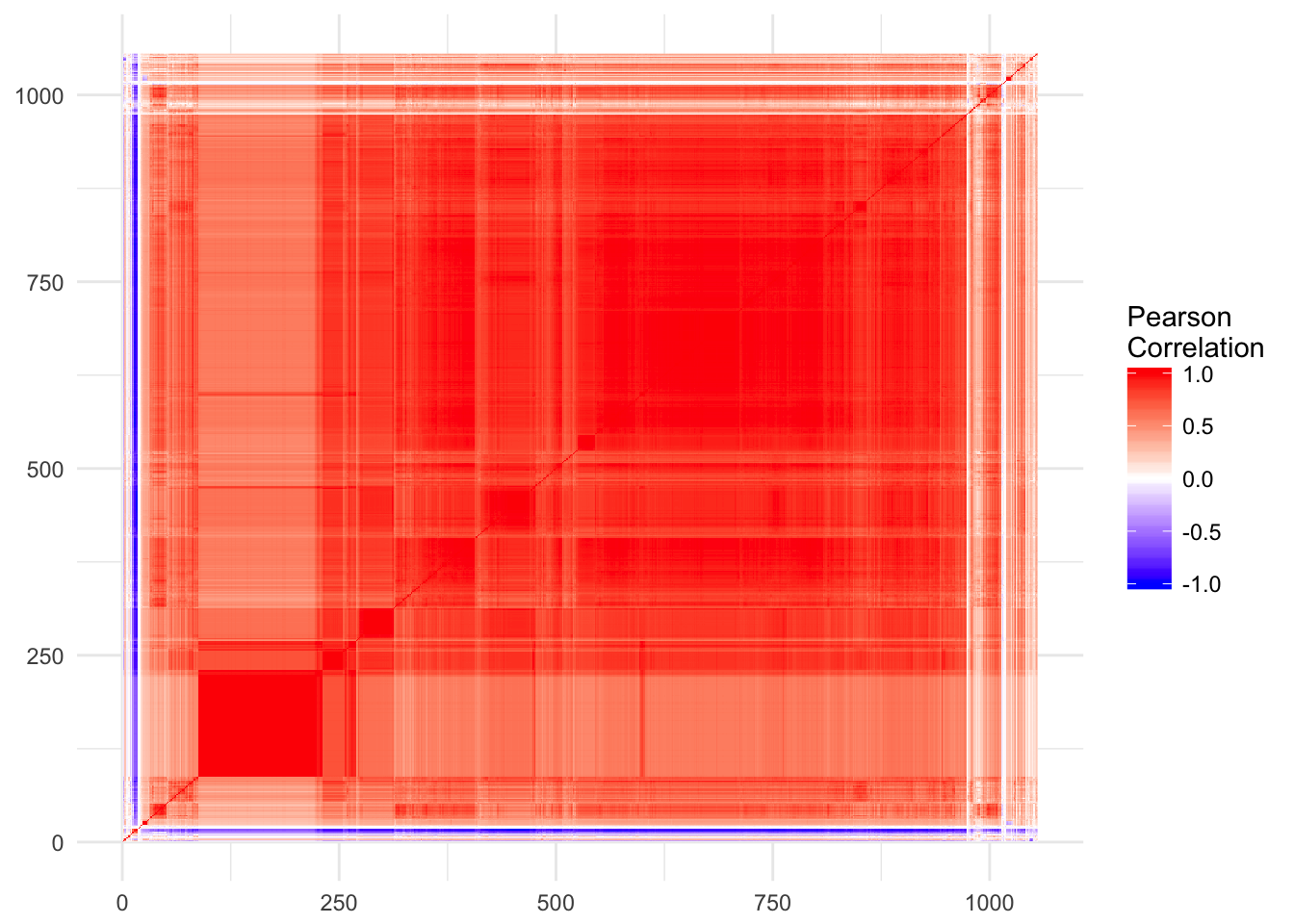
Define a distance metric between predictions, and order them by similarity
Code
reorder_cormat <-function(cormat){# Use correlation between variables as distancedd <-as.dist((1-cormat)/2)hc <-hclust(dd)cormat <-cormat[hc$order, hc$order]}
---title: "The Modularity of Kaggle NCAA Predictions"author: "Kieran Mace"date: "2016-04-17"categories: [R]tags: ["R Markdown", "plot", "regression"]format: html: default---```{r setup, include=FALSE}knitr::opts_chunk$set(collapse = TRUE, eval = FALSE)```# Setup:We want to look at all the kaggle submissions for 2016. first of all we need to download the data [here](https://www.kaggle.com/wcukierski/2016-march-ml-mania/downloads/2016-march-machine-learning-mania-predictions.zip "Kaggle NCAA Predictions")# AnalysisNow lets run some R! First lets load in the data:```{r, warning=FALSE, message=FALSE}library(dplyr)library(readr)library(stringr)library(ggplot2)library(reshape2)rm(list=ls())# Get list of all filesfiles <- list.files(path='predictions/', pattern='*.csv', full.names=T)# Load all filesallPredictions <- lapply(files, function(f) read.csv(f, stringsAsFactors = F))```# Join all the predicitons, remove bad predictions, and calulate correlation```{r}pred =data.frame(lapply(allPredictions, function(x) x[,2]))# some preditions renedered to factor, remove thesepred.clean = pred[,-which(unlist(lapply(pred,class))=="factor")]cormat <-round(cor(pred.clean),2)# some correlations result in NA, remove thoseidx =which(is.na(cormat[1,]))cormat = cormat[-idx,-idx]```# Define a distance metric between predictions, and order them by similarity```{r}reorder_cormat <-function(cormat){# Use correlation between variables as distancedd <-as.dist((1-cormat)/2)hc <-hclust(dd)cormat <-cormat[hc$order, hc$order]}```# Rename the predictions and melt for plotting```{r}cormat <-reorder_cormat(cormat)colnames(cormat) =1:dim(cormat)[1]rownames(cormat) =1:dim(cormat)[1]melted_cormat <-melt(cormat, na.rm =TRUE)```# Create the heatmap```{r}# Create a ggheatmapcovariance_plot =ggplot(melted_cormat, aes(Var2, Var1, fill = value)) +geom_raster() +scale_fill_gradient2(low ="blue",high ="red",mid ="white",midpoint =0,limit =c(-1,1),space ="Lab",name="Pearson\nCorrelation") +theme_minimal() +theme(axis.title.x =element_blank(),axis.title.y =element_blank())covariance_plot```